 | Advanced Styles |
This section contains more detailed information about HyperTextStyles.
This topic contains the following sections:
The Introduction to HyperTextStyles tutorial describes some of the basic concepts for creating, assigning, and editing HyperTextStyles assets. In addition to specifying default text and link properties, however, HyperTextStyles allow you to define custom link classes, styling tags, and quad classes for displaying Sprites inline with text. The controls for all of these items can be found in the Custom Styles section at the bottom of the HyperTextStyles inspector.
 Link Subclasses
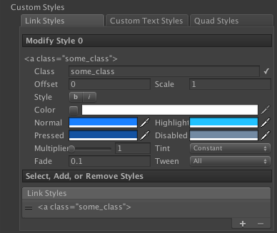
The Link Styles tab in the HyperTextStyles inspector allows you to define further link subclasses. Link subclasses allow you to re-define any properties associated with link styling, including:
- Vertical Offset (as a percentage of the surrounding font size)
- Scale (as a percentage of the surrounding font size)
- Font Style
- Link State Colors and Transition Properties
When you define a custom link subclass, it must have a unique class name on the HyperTextStyles object. If a class name appears more than once in the list of link styles, the inspector will display an error icon to alert you to the problem. The label text of each link subclass entry in the inspector serves as a syntax reminder; to use a custom link subclass, simply include the class attribute in your <a> tag, as in "<a name="link_id" class="class_name">Link Text</a>".
Custom Tags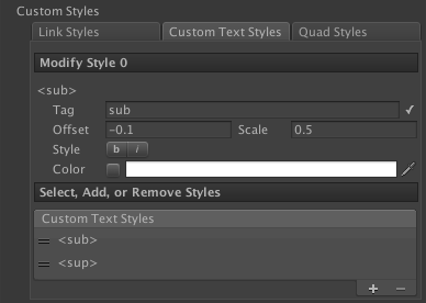
The Custom Text Styles tab in the HyperTextStyles inspector allows you to define your own custom tags. These tags allow you to re-define any properties associated with default styling, including:
- Vertical Offset (as a percentage of the surrounding font size)
- Scale (as a percentage of the surrounding font size)
- Font Style
- Color
When you define a custom tag, it must have a unique tag value on the HyperTextStyles object. If a tag appears more than once in the list of tags, the inspector will display an error icon to alert you to the problem. The label text of each tag entry in the inspector serves as a syntax reminder; to use a custom tag, enclose some text in an open/close pair of tags, as in "E=mc<sup>2</sup>".
Quads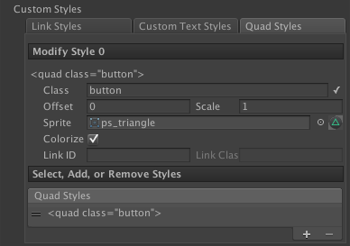
The Quad Styles tab in the HyperTextStyles inspector allows you to define classes of quads that should appear inline with your text. Quad classes allow you define:
- Vertical Offset (as a percentage of the surrounding font size)
- Scale (as a percentage of the surrounding font size)
- Sprite
- Color Tint Inheritance
- Automatic Link Creation
The Colorize option specifies whether or not instances of the quad should use the text color styling of the surrounding text. For example, if you have an alpha-only icon you wish to display in-line using the same color as the text, use a white Sprite and enable this value. If you have an icon with several colors, such as a button on a game console controller, you should leave this value disabled so that instances of this quad will simply use white vertex colors (i.e. no tint).
If you assign a value to the Link ID field, then all instances of the quad will automatically become links whose name attribute matches this value. If a value is specified, then you can optionally also specify a Link Class value, which will make all instances of the quad use the styling of the specified link subclass.
 Note Note |
|---|
Note that the Colorize value ultimately determines whether or not quad instances will use any link style color properties. |
When you define a custom quad style, it must have a unique class name on the HyperTextStyles object. If a class name appears more than once in the list of quad styles, the inspector will display an error icon to alert you to the problem. The label text of each quad style entry in the inspector serves as a syntax reminder; to display a custom quad, use the <quad> tag with the class attribute in place of the standard sizing and UV coordinate attributes, as in "<quad class="button">".
InheritanceAs you define more custom styles, it often becomes helpful to logically separate them in order to minimize redundancy and to simplify substitutions. HyperTextStyles implement an inheritance system that allows styles to cascade through sheets. To inherit from other HyperTextStyles, use the Inherited Styles control at the top of the HyperTextStyles inspector. When at least one sheet is assigned to this list, override checkboxes are added to each of the default style properties in the inspector. Just as with the HyperText component, toggling any one of these properties activates its controls and allows you to override the style inherited for the particular property. All custom styles are also automatically inherited through the cascade (so a sheet provides access to any styles defined in its inheritance chain, as well as in their inheritance chains, and so on). Selecting one of the custom style tabs at the bottom of the HyperTextStyles inspector displays the names of all styles inherited, as well as the name of the sheet on which the style being inherited is defined. Defining a style with one of these identifier on the current HyperTextStyles asset will override whatever style is with that identifier is inherited. The list of inherited HyperTextStyles is processed in order, so later entries will override any styles defined in earlier entries if there are any conflicts. (The last entry in the list of inherited styles will be labeled as (Parent) to indicate it is the most authoritative of the inherited HyperTextStyles. The Font that cascades to the end of the chain is the last non-null Font defined in the inheritance list. | HyperTextStyles Inheritance Example 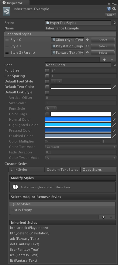 |
See Also